The Challenge
Working on this project came with a few key challenges that we’ve never been faced with before. This class was
particularly special, because it was the second group project but first project where we were given certain roles.
These roles dictated our individual assignments and we had to build trust in each other in order to run the project
smoothly. As a team, we faced some constraints, too. Everyone had a busy schedule and we were forced to meet at
unfavorable times.
The Team
Working with four other people, each with primary, secondary, or tertiary roles in project management, design, development,
and data architecture, our first assignment entailed creating a project page. This project page established our group name
“Blueprints” and based our color palette, font, and style around this concept.
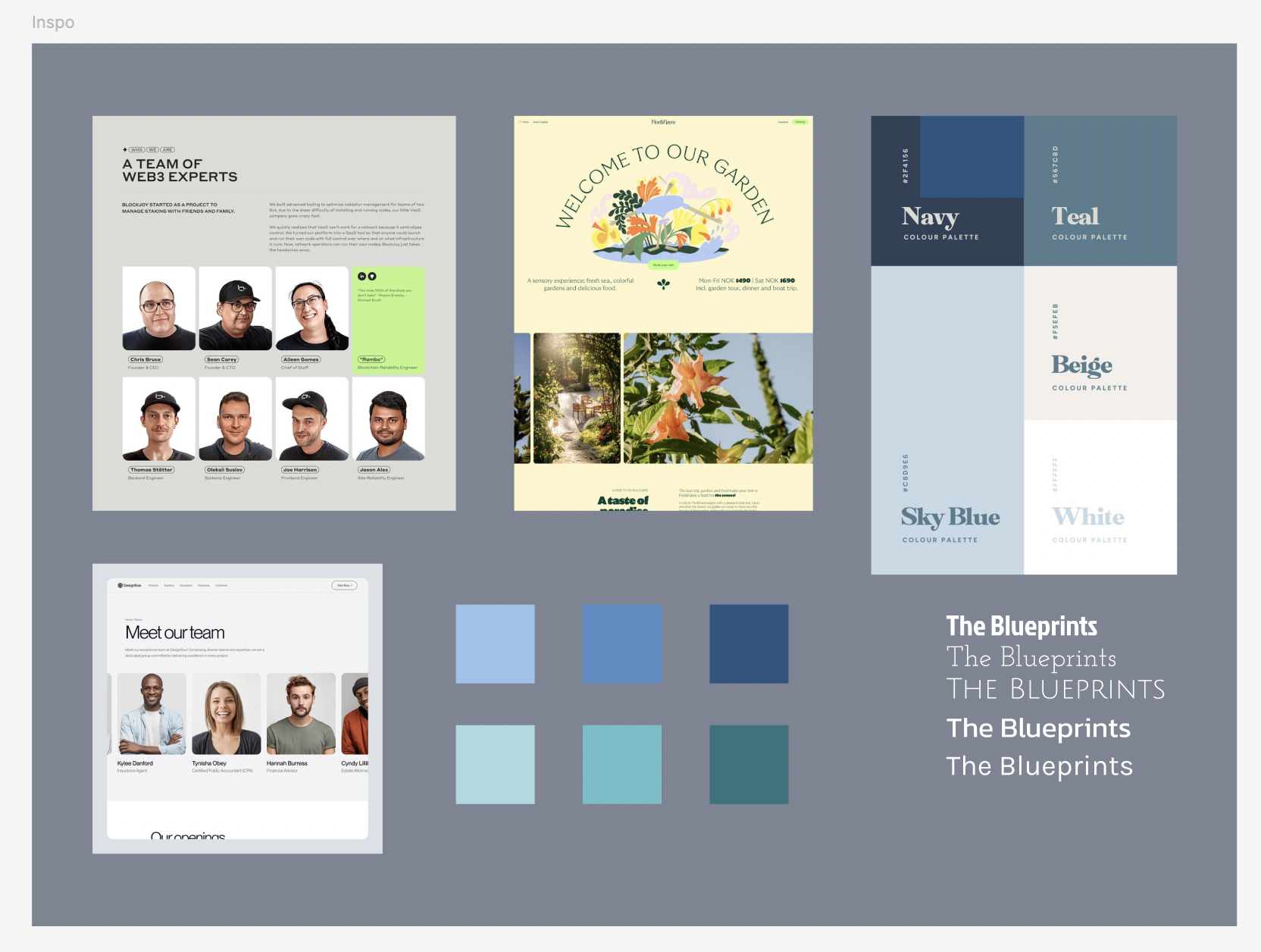
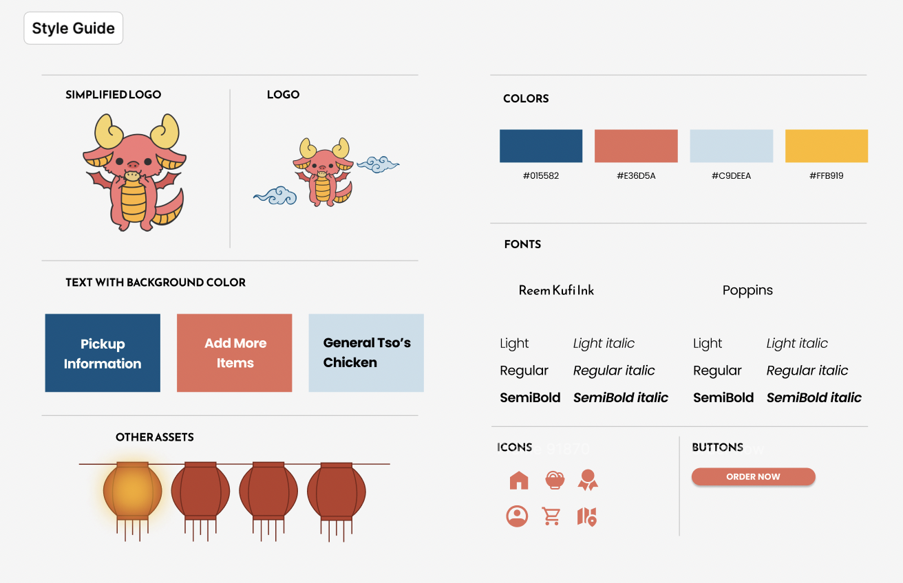
Our branding was based on the previous designs from IDM215 and also the colors on the food truck that makes it recognizable.
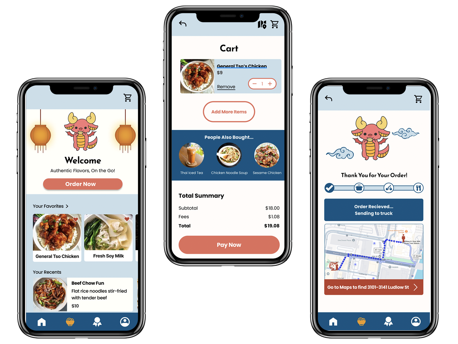
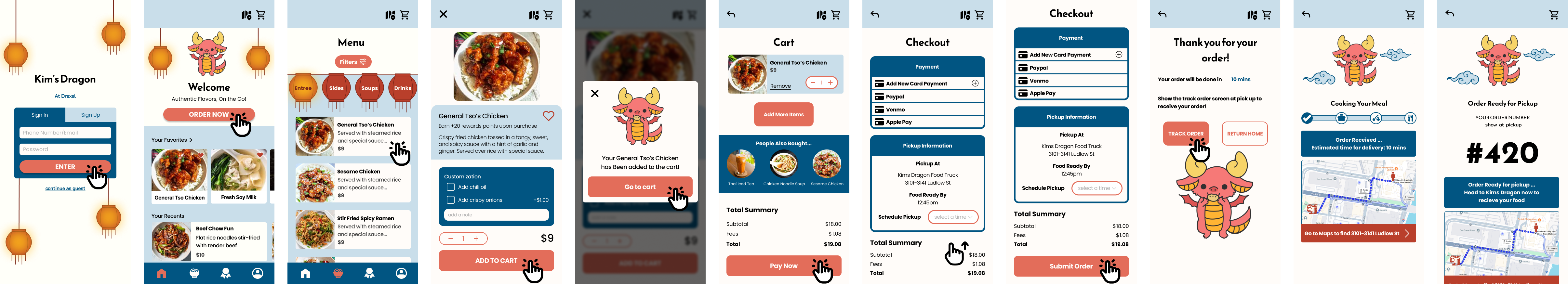
To improve customization and ordering, we implemented button-based options that allow users to make intuitive meal
adjustments. We also made tipping selections more accessible and gave users the ability to set quantities to 0 for better
control and clarity over their order. These refinements were made based on user feedback that showed a preference for clear
and simple customization options.
In the payment and checkout process, we simplified the flow by adding payment-specific pop-ups, clearer card input
instructions, and a message about points. These updates ensure that the checkout process is straightforward, reducing
confusion and streamlining the final steps of the ordering process.
These additions expand the app's offerings and allow users to complete their orders more smoothly without unnecessary detours.
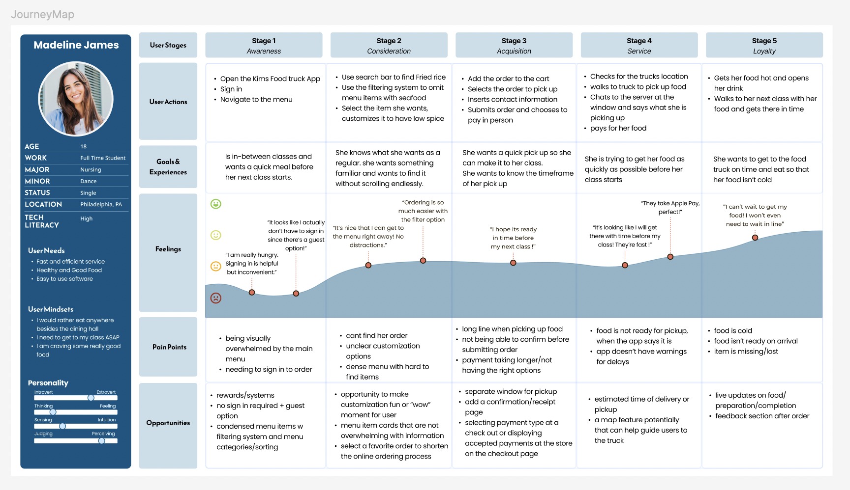
User Persona
For much of our design and audience research, we were able to refer to IDM215 for the information. Here we have Madeline
James, who represents the average college student struggling to find an affordable and accessible meal between her busy schedule.
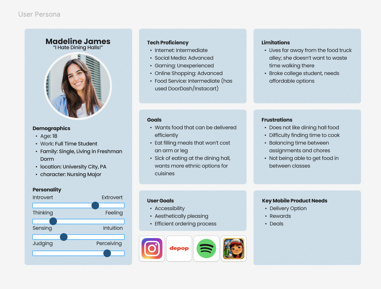
Her journey map outlines the different stages of her ordering process including her thoughts and motivations behind each action.
Critical Path
Adjusting the original version to touch up obvious mistakes, we created a basic critical path to showcase the navigation
of our main flow.
Usability Testing
Upon refining the previous prototype, We began a series of usability tests and additional development based on feedback.
Here we had three stages of testing: the Alpha, the Beta, and the Final. Every stage included five user interviews conducted
with an updated usability test script and core developmental features that were added.
As the lead data architect and secondary designer, I was heavily involved in this project's design and research aspects.
From the tests, we were able to add microinteractions, transitions between pages, button designs, and more.
VIEW FINAL
Takeaways
This final design showcases how thoughtful planning and user-focused problem-solving can benefit both customers and
businesses. Although this project was based on merely a prompt, it introduced me to my first collaborative UX project.
I learned to refine designs based off of usability testings and to enhance interacting features.
As a team, we coordinated and communicated very well, navigating through our busy schedules. Working through our new
roles created limitations, but the team was able to rely on each other.